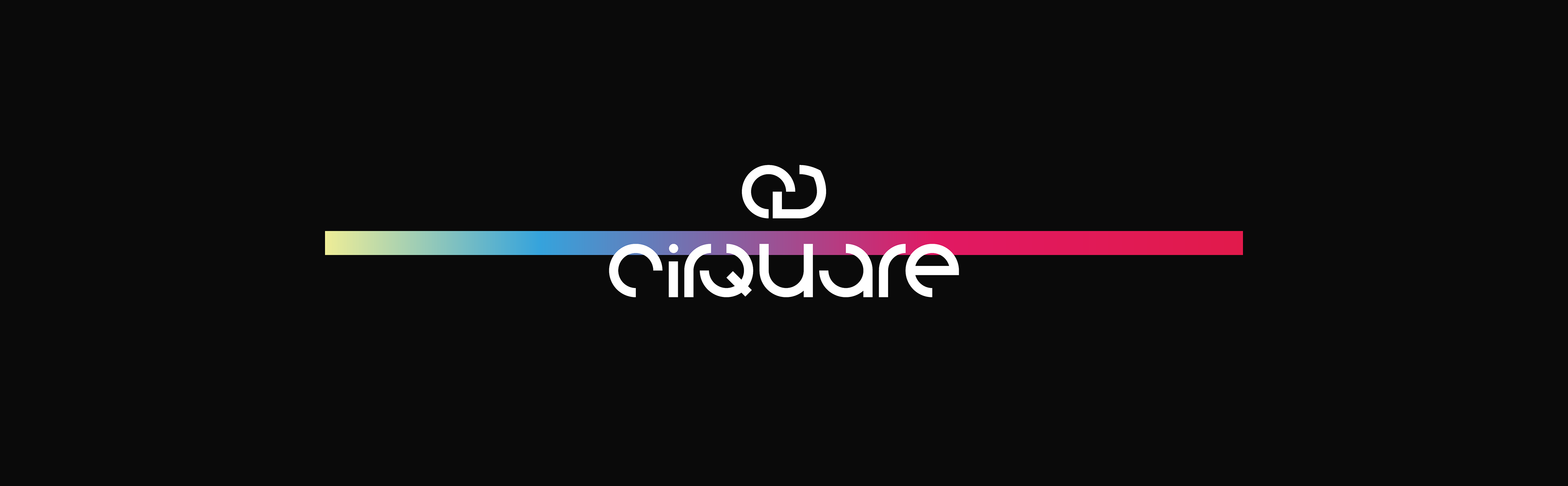
Cirquare Personal Branding 2020
Introducing the new visual identity of the Cirquare.
'Cirquare'의 새로운 비주얼 아이덴티티를 소개합니다.
History
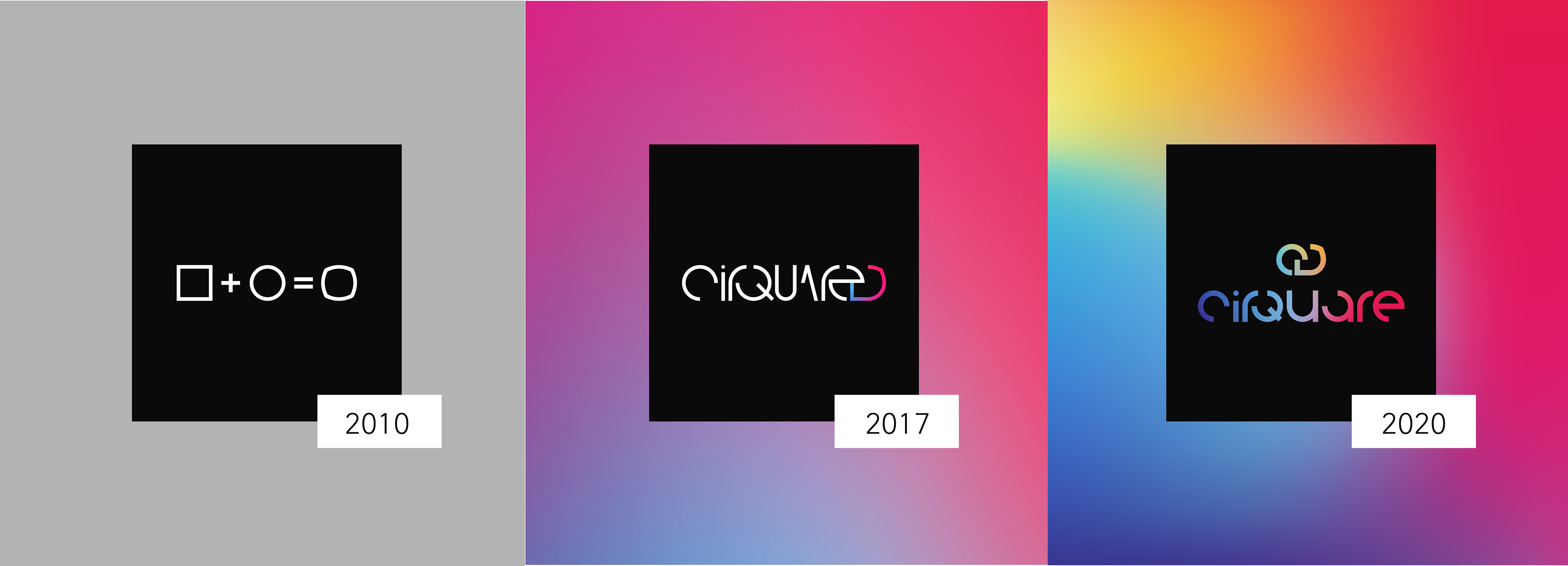
2010 original : The first symbol inspired by the fusion of squares and circles.
2017 renewal : Expressing convergence and synergy using existing symbol's combinations and complementary color gradient colors.
2010 original : 사각형과 원의 융합으로부터 영감을 얻은 최초의 심볼
2017 renewal : 기존 심볼 형태의 분해 조합 및 보색 그라데이션 색상을 이용해 융합과 시너지를 표현한 리뉴얼

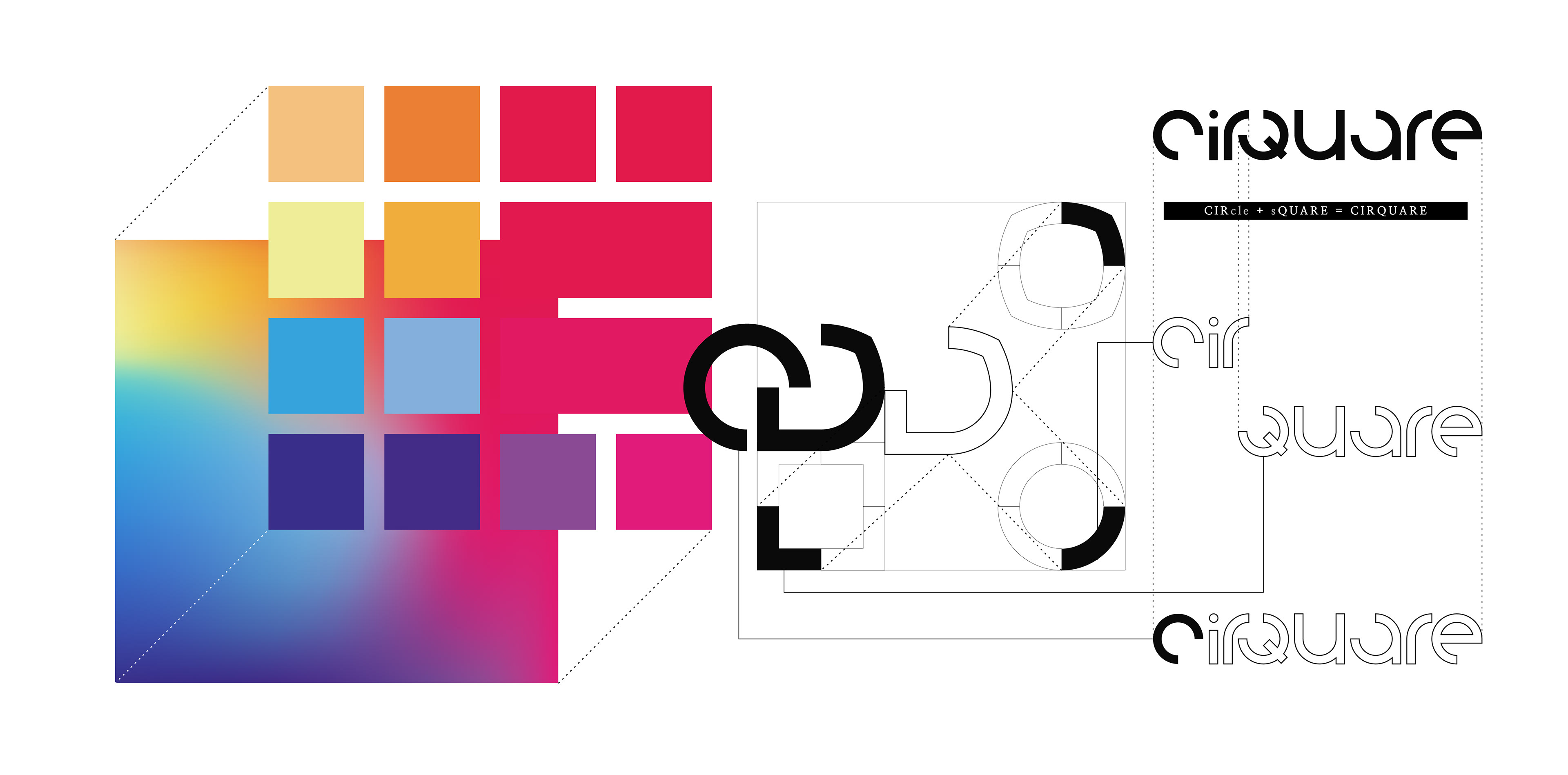
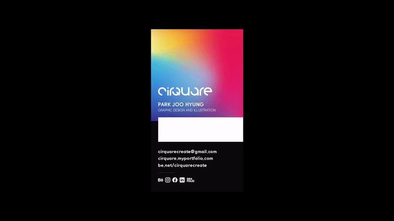
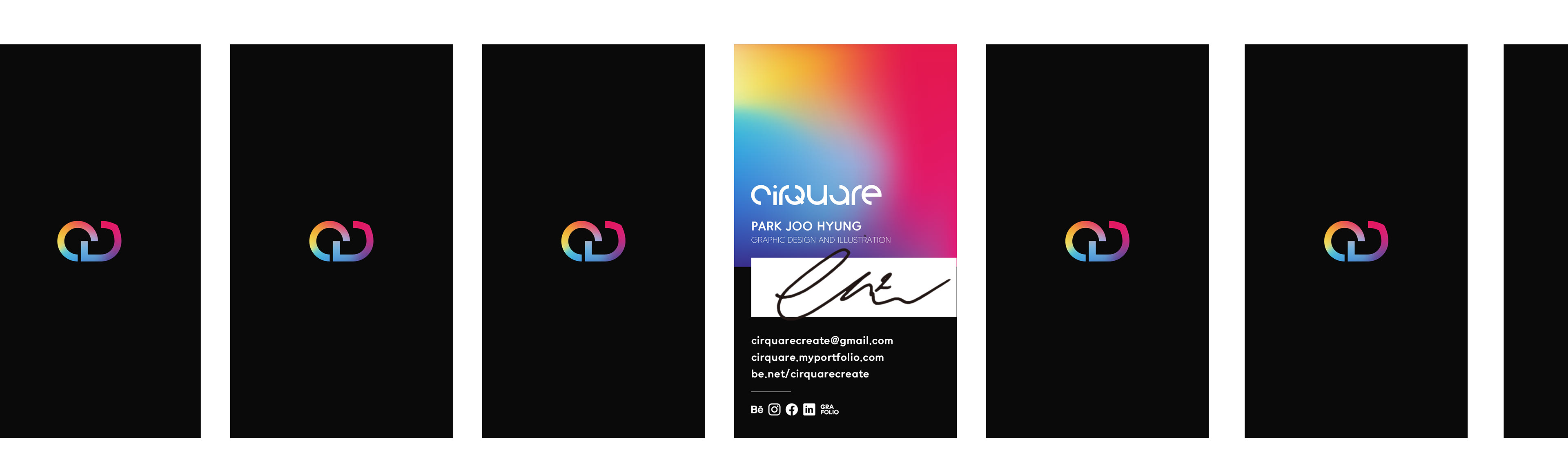
2020 Cirquare
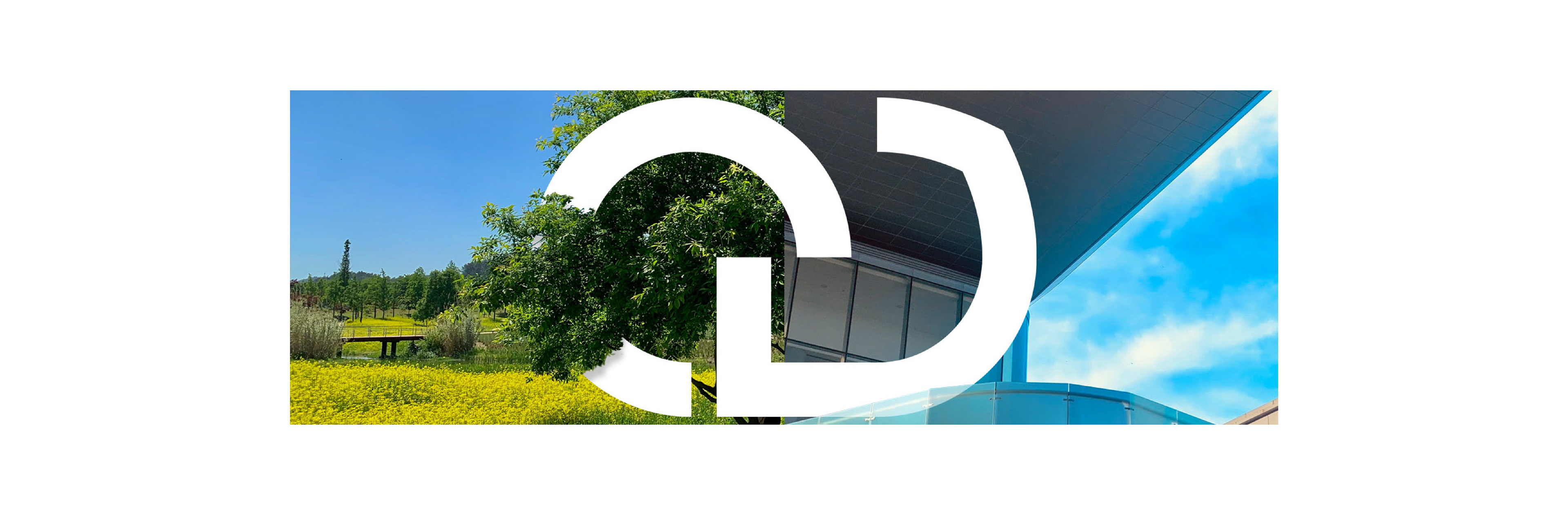
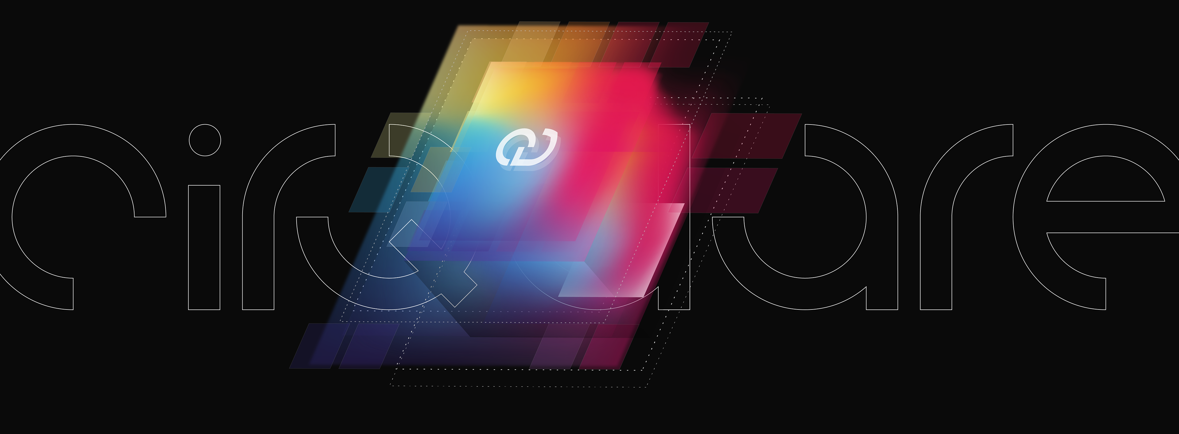
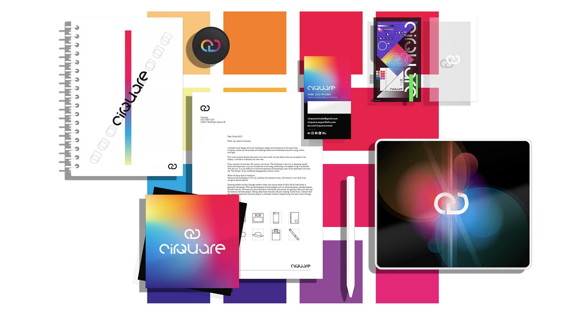
Renewed in 2020, the Cirquare Visual Identity employs bolder symbols and typos to express a clearer visual presence.
The color is designed to take a step further from the "fusion of different colors" symbolized by the existing three-color gradient, and to symbolize the "harmony of infinite diversity" through the color space mesh gradient, in which various colors coexist.
2020년 리뉴얼된 Cirquare 비주얼 아이덴티티는 보다 굵어진 심볼과 타이포를 채용해 더 뚜렷하고 선명한 시각적 존재감을 표현했습니다.
색상은 기존의 3색 그라데이션이 상징했었던 '서로 다른 색상의 융합'에서 한걸음 더 나아가 다채로운 색상이 공존하는 색 공간 메시 그라데이션을 통해 '무수한 다양성의 조화'를 상징하도록 설계하였습니다.
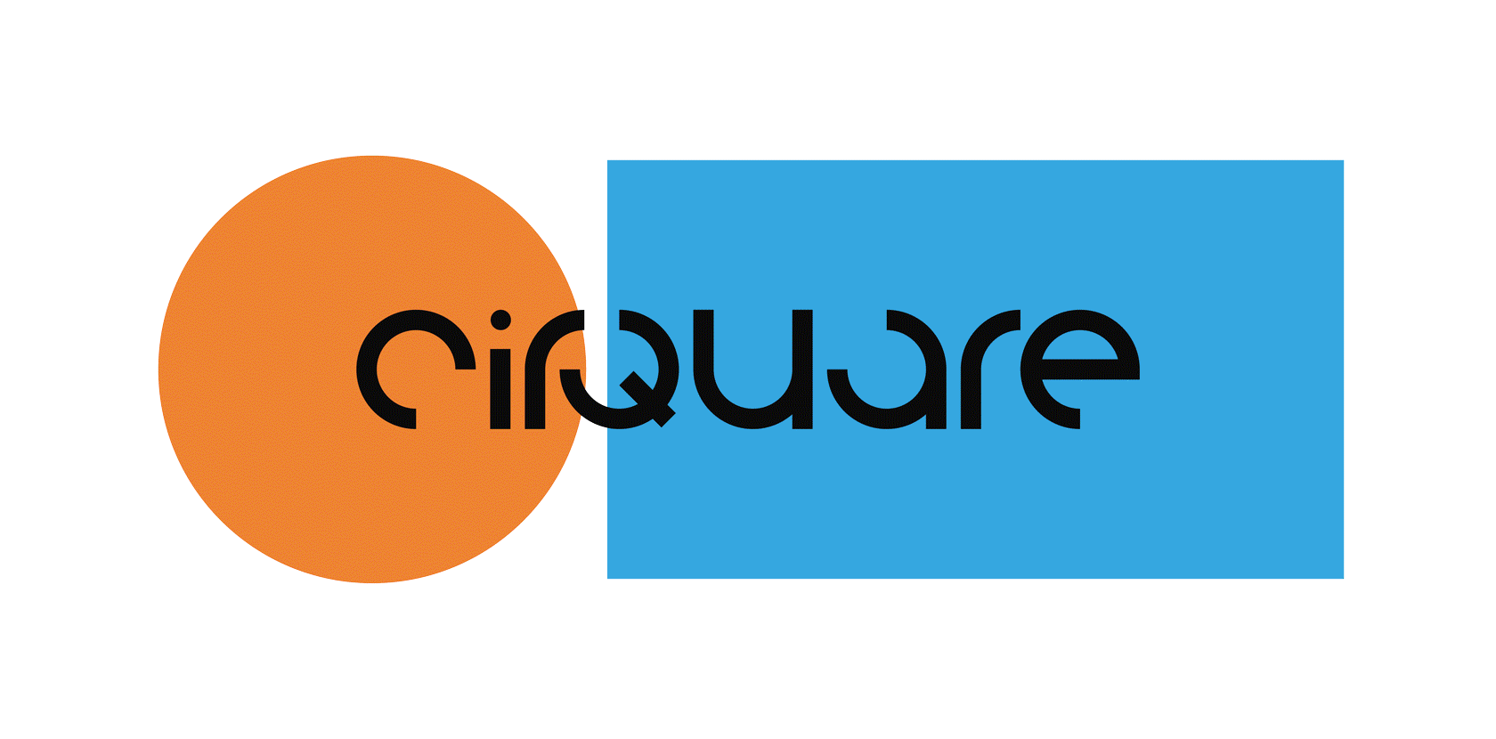
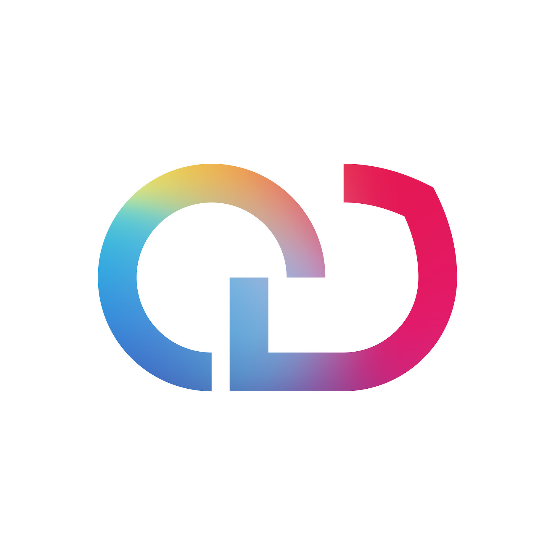
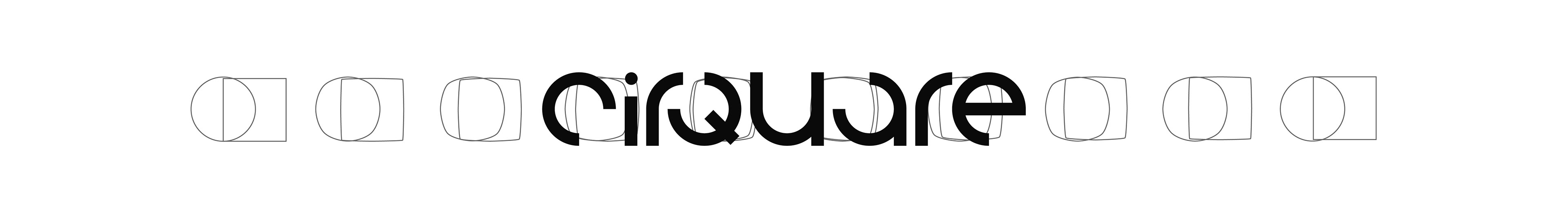
CIRcle + sQUARE = CIRQUARE
The key symbol, 'The Combination of Circle and Square', is the fusion and harmony of 'art and design', 'natural and human', 'emotion and reason', 'intuition and logic' to create a more original and beautiful design based on data and technology.
핵심 상징인 '원과 사각형의 결합'은 아트와 디자인, 자연과 인간, 감성과 이성, 직감과 논리의 융합과 조화로 데이터와 기술에 기반하면서도 보다 독창적이고 아름다운 디자인을 이루어내는 것을 상징합니다.
Thanks to Watch